For years, our household tried to stay organized using a mix of phone calendars, paper planners, and handwritten notes stuck to the fridge.
Even with everything “synced,” we still missed events or double-booked evenings. The issue wasn’t access to information — it was visibility. If you don’t see the schedule, you don’t think about it.
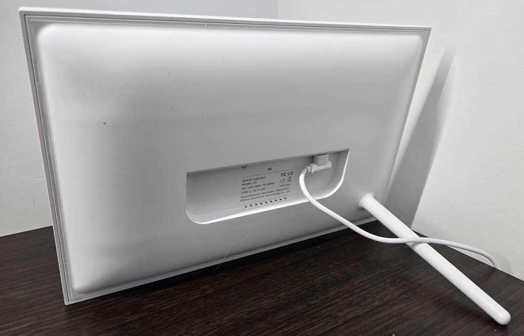
The Linkdaze Digital Calendar promised a shared, always-visible schedule for the whole household. It’s designed to be wall-mounted like a traditional calendar, but after some experimenting, we actually chose to use it with the included stand and keep it upright on our kitchen countertop.
That decision ended up shaping how we used it day to day — and, honestly, made it even more useful.
First Impressions & Setup
Out of the box, the Linkdaze feels more like a household fixture than a piece of tech. The display is clean, modern, and neutral enough to blend into a kitchen, hallway, or home office without drawing unnecessary attention.
Mounting the calendar on the wall is absolutely an option, and the hardware for that is included. We initially considered mounting it near the dining area, but ultimately decided to try the stand first.
Keeping it on the countertop made it easier to reposition, experiment with placement, and see how it fit into our daily flow before committing to wall holes.
Setup was straightforward. Power it on, download the app, connect to Wi-Fi, and follow the guided prompts on the screen.
Within about 15 minutes, our shared calendars were synced and visible. Seeing appointments appear immediately gave us confidence that it was going to integrate smoothly. Very easy!
Daily Use — How It Changed Our Routines
Living with the Linkdaze Digital Calendar day to day is where its value really becomes obvious. This isn’t something you check once in the morning and forget — it becomes part of the rhythm of the house.
Always in View, Always Useful
Because we keep it upright on the countertop, the calendar sits naturally in our line of sight during moments that already involve pauses: making coffee, packing lunches, prepping dinner, or walking by between rooms.
Those repeated, casual glances add up. Instead of consciously “checking the calendar,” the schedule just stays top of mind.
Over time, we noticed fewer surprises. Appointments didn’t sneak up on us. Events felt expected rather than rushed. That passive awareness made a bigger difference than any reminder notification ever has.
A Screen That Actually Draws You In
One thing I didn’t expect to appreciate so much is just how beautiful the display is. The screen is bright, vibrant, and colorful without being over-saturated.
Colors are accurate and crisp — blues, greens, and accent colors look intentional rather than washed out or harsh. It genuinely looks like a premium display, not a repurposed tablet panel.
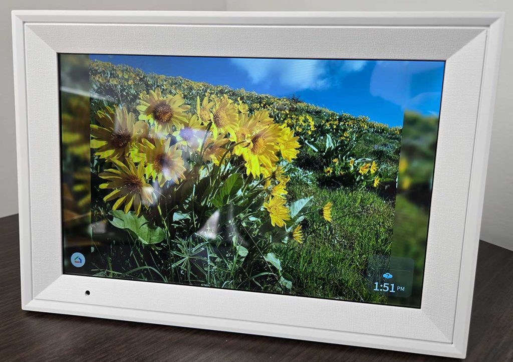
Color-coded events pop clearly against the background, making it easy to distinguish schedules at a glance.
Even from across the room, you can tell whose day is packed and whose is lighter just by scanning the colors. That visual clarity reduces cognitive load — you’re not reading, you’re recognizing.
Comfortable to Look At All Day
Despite the vibrancy, the screen never feels overwhelming. Automatic brightness adjustment works well throughout the day, subtly adapting to sunlight in the kitchen or dimmer evening lighting.

At night, it softens enough that it doesn’t dominate the room or feel distracting.
That balance — bright and colorful when needed, calm and subtle when not — is what makes it feel like a household fixture rather than a glowing screen demanding attention.
Shared Moments, Shared Planning
Another thing we didn’t anticipate was how often the calendar became a conversation anchor.
Instead of everyone pulling out phones during planning discussions, we’d gather around the counter and look at the calendar together. Swiping through the week felt collaborative rather than isolating.
The vibrant display helped here too. Seeing everyone’s commitments laid out visually made planning feel less abstract. You could immediately spot open time, conflicts, or busy days without scrolling or tapping through menus.
Reduced Mental Overhead
Perhaps the biggest daily benefit was how much mental energy it freed up. We stopped mentally tracking dates and times “just in case.”
The calendar held that responsibility for us. The bright, readable screen reinforced that trust — you glance, you know, you move on.
That sense of confidence made daily routines calmer. Less double-checking. Less asking. Less forgetting.
Interface & Touchscreen Experience
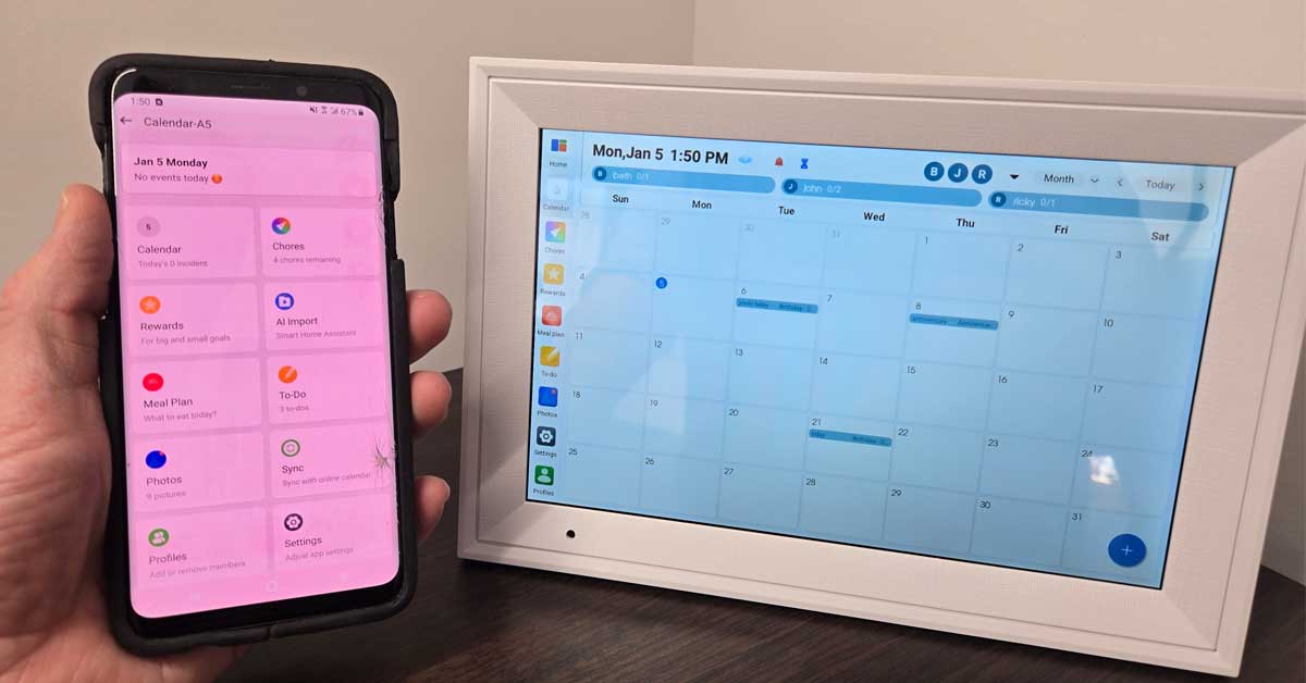
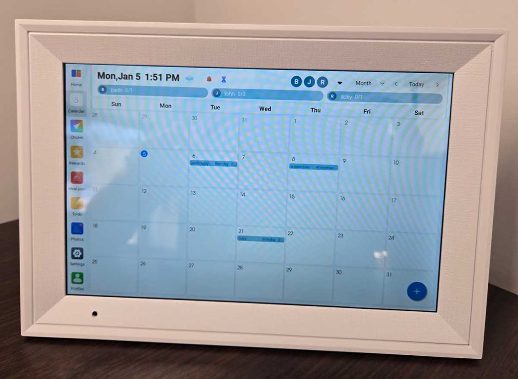
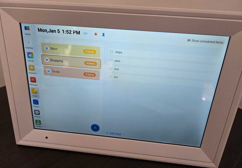
The touchscreen is responsive and easy to use. Swiping between day, week, and month views feels natural, and the layout prioritizes readability over flashy visuals.
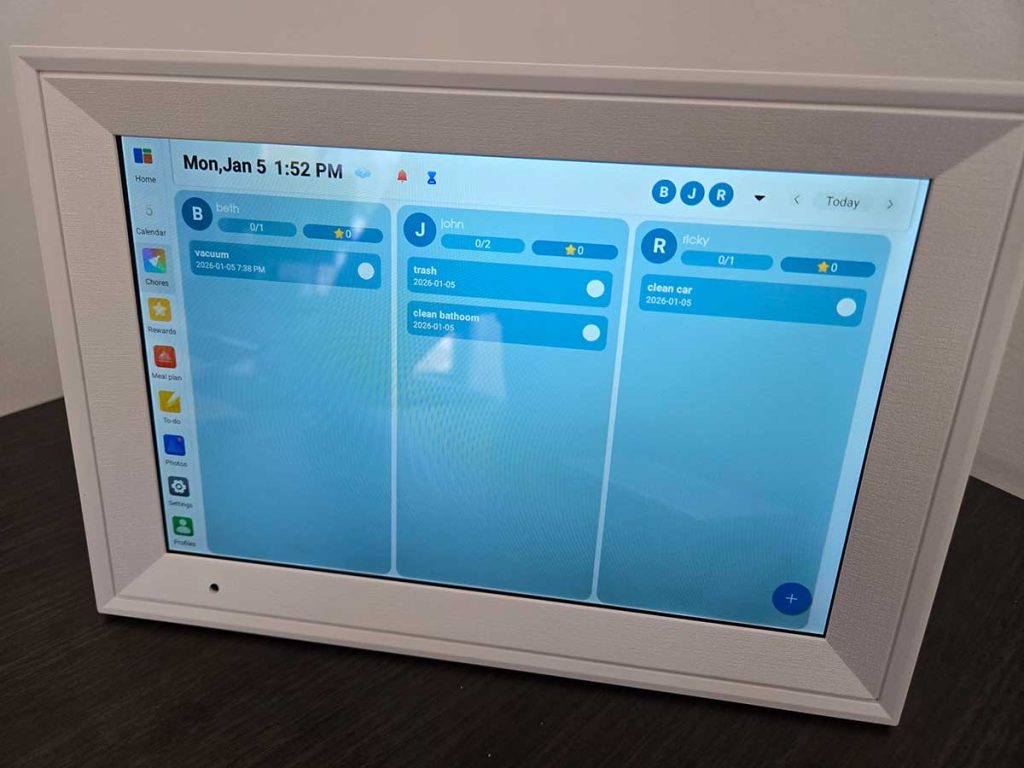
The week view became our default because it shows enough detail without feeling crowded. Color-coded events make it easy to see who’s busy and when, even from across the room.
You can add or edit simple events directly on the screen, which works well for quick reminders. For more detailed entries, using a phone is still faster — but that’s expected.
The Linkdaze calendar complements existing apps rather than trying to replace them.
Calendar Syncing & Shared Scheduling
We synced multiple calendars across different platforms, and everything merged into a single, clean view. Updates made on phones appeared quickly on the display, which helped maintain trust in the system.
That trust is important — if people don’t believe the calendar is accurate, they stop checking it. With Linkdaze, it stayed reliable enough that everyone defaulted to it as the “source of truth.”
Real-World Moments Where It Helped
- Busy weekdays: Seeing school events, meetings, and errands laid out visually reduced last-minute surprises.
- Planning conversations: Instead of opening phones mid-conversation, we stood around the counter and planned together.
- Guests or babysitters: Anyone could understand the schedule without needing app access.
- Work-from-home balance: Seeing personal and work events together helped prevent overbooking days.
The countertop placement made these interactions feel natural and communal.

What I Loved
- Flexible placement: wall-mountable, but equally useful on a countertop
- Always-visible shared schedule
- Clean, readable layout
- Reliable syncing across multiple calendar services
- Touchscreen interaction that feels natural
- Encourages planning without reminders or notifications
What Could Be Better
- Placement choice matters — it needs good Wi-Fi and visibility
- More customization options (themes, layouts) would be nice
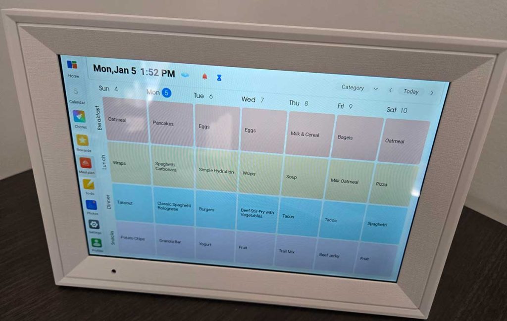
- Not designed as a full productivity or notes hub. Unlike general-purpose tablets that can overwhelm users with notifications, Linkdaze is designed as a dedicated space for what matters most — shared family time and schedules. It’s built for clarity, not complexity.
- No built-in smart assistant or camera (by design). The absence of a camera or smart assistant is a deliberate privacy-by-design choice, ensuring the device feels safe and comfortable in intimate family spaces.
Final Thoughts
After weeks of use, the Linkdaze Digital Calendar stopped feeling like a device and started feeling like part of the house. While it’s designed to be wall-mounted, using it on the countertop with the stand made it more interactive, more visible, and more naturally integrated into daily routines.
Its real value isn’t in flashy features — it’s in how it makes scheduling shared, visible, and stress-free. If your household struggles with keeping everyone aligned, this calendar doesn’t just organize your time — it changes how you think about it.
If you want a digital calendar that people actually look at and use, the Linkdaze delivers — whether you mount it on the wall or let it live right where life happens.
Meet Ry, “TechGuru,” a 36-year-old technology enthusiast with a deep passion for tech innovations. With extensive experience, he specializes in gaming hardware and software, and has expertise in gadgets, custom PCs, and audio.
Besides writing about tech and reviewing new products, he enjoys traveling, hiking, and photography. Committed to keeping up with the latest industry trends, he aims to guide readers in making informed tech decisions.