TL;DR – You cannot change the color scheme of Google Maps. However, if you’re using the mobile version, you can switch to Dark Mode to opt out of the new colors that Google recently introduced. Unfortunately, this is not an option for desktop users.
In an era where digital tools are intrinsic to our navigation and exploration of the world, the recent redesign of Google Maps’ color scheme has become a subject of heated debate.
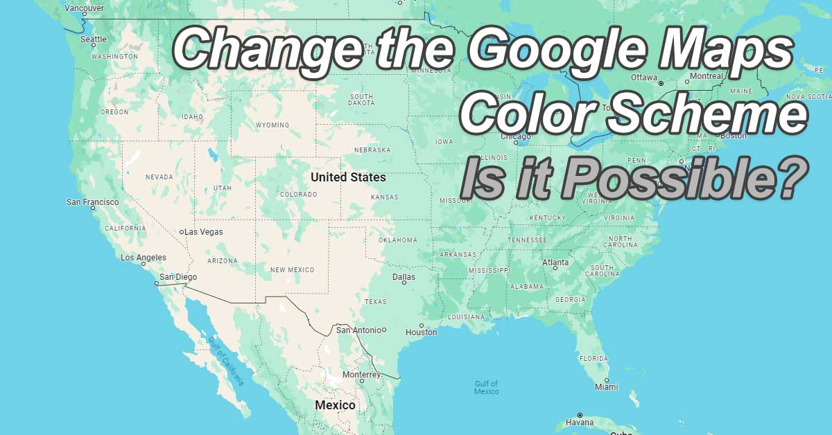
The updated palette, where Google has introduced muted tones and a reimagined color logic, is intended to enhance user experience and map readability.
However, this shift has met with opposition from a community of users who have developed a strong familiarity with the application’s previous color scheme.
It leaves many of us wondering – is there a way to change the Google Maps color back to “normal.” You know – the way it was before the color change update? First, let’s talk about the actual changes Google made.
Recent Google Maps Color Changes
Google Maps has recently introduced a series of subtle yet noticeable changes to its color scheme. It marks a significant shift in the visual experience for users.
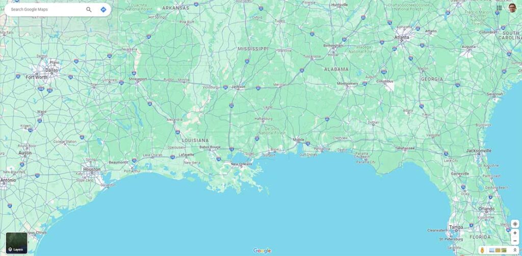
The update ushers in a new palette that includes a lighter blue for water bodies, aiming to enhance readability and contrast.
Land areas previously depicted in a solid green now take on a more turquoise tone, purportedly to better represent vegetation.
Roads, which once stood out in yellow, have been muted to a more neutral gray, likely to reduce visual clutter and improve the layering of information.
These adjustments, while not drastic, have been strategically implemented to refine the map’s aesthetics and functionality, ensuring that the interface remains intuitive and user-friendly. But many aren’t a fan. Let’s talk about that.
User Reactions and Feedback
While the updated color palette of Google Maps aims to refine user experience, the reaction among users has been diverse. The majority of users have expressed dissatisfaction over the new visual direction.
Many have taken to forums and social media to voice their concerns, with particular emphasis on the loss of the familiar yellow roads and the shift toward more muted colors.
This feedback suggests that the change has impacted the app’s usability for some, as the new scheme may affect visibility and map readability.
The lack of an opt-out feature on the desktop version has further fueled the discontent, leaving many who prefer the classic look without recourse.
Google’s initiative to modernize the map aesthetic has, therefore, has been met with a mixed reception. Thus, underscoring the challenge of altering a widely used interface.
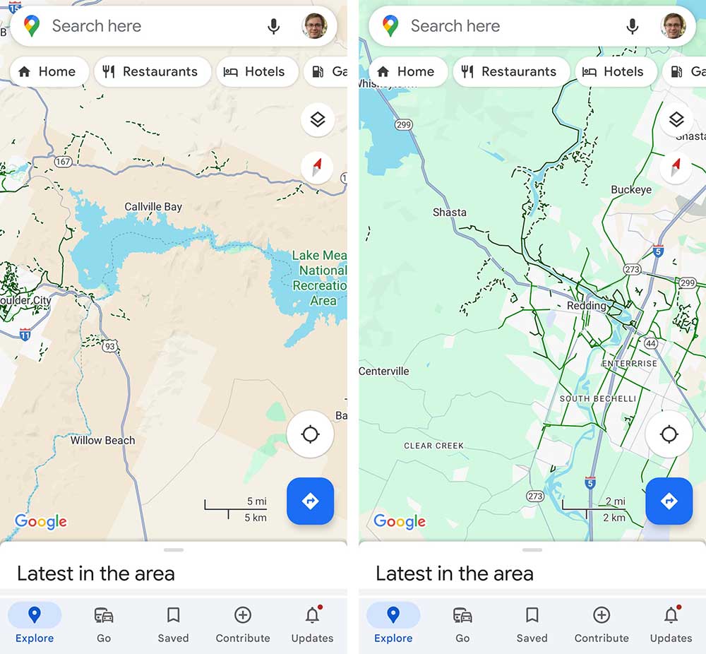
Mobile App Dark Mode Workaround
Seeking solace in the familiar, users discontented with Google Maps’ new color scheme have found a workaround in the mobile app’s dark mode feature.
By enabling dark mode, users can temporarily bypass the recently introduced hues. This feature, accessible through the app’s settings, allows users to revert to a color palette that closely mirrors the previous design, albeit with darker tones suitable for low-light environments.
Here’s how to activate dark mode:
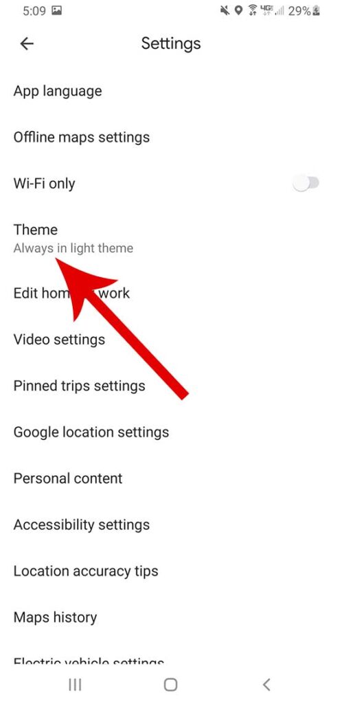
1. Go to the Google Maps app on your mobile device and tap your profile icon in the top right corner.
2. Click on “Settings”.
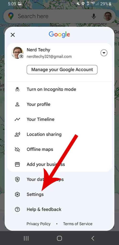
3. Under the settings list, tap on “Theme”.
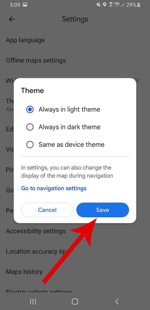
4. Choose from three different options; Always in light theme, Always in dark theme, or Same as device theme and tap “Save”.
Note: This solution, however, is exclusive to the mobile app, leaving desktop users without an alternative to the new color scheme.
Desktop Version Limitations
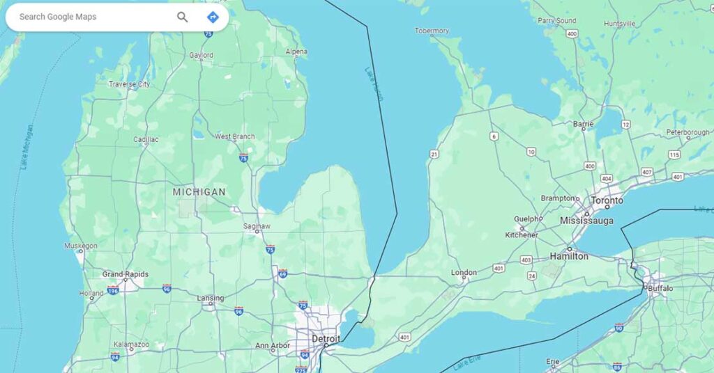
Unfortunately for those who prefer the classic aesthetic, the desktop version of Google Maps offers no escape from the newly implemented color scheme.
The revision, which includes a lighter blue for water bodies and a more turquoise hue for green areas, is mandatory for desktop users.
Unlike the mobile app, which provides a dark mode option that reverts to the traditional color palette, the desktop interface lacks such an alternative.
The new colors are now a permanent fixture of the desktop experience, compelling users to adapt without the possibility of reverting to the previous design.
Conclusion
The recent color scheme update to Google Maps has elicited a spectrum of responses from the user community. It’s almost as frustrating as when some may find a missing preview button with no start button. All in all, it reveals the significance of visual design in digital cartography.
Yes, some users have found solace in the mobile app’s dark mode feature. But limitations persist in the desktop version, underscoring the need for user customization.
Luckily, switching to a dark theme is a nice workaround that many have now implemented. Sure, it’s not a true solution. Google still doesn’t give you the freedom to adjust the color scheme at-will. But hopefully, one day they will. Until then, we’re stuck with this simple workaround.
Meet Ry, “TechGuru,” a 36-year-old technology enthusiast with a deep passion for tech innovations. With extensive experience, he specializes in gaming hardware and software, and has expertise in gadgets, custom PCs, and audio.
Besides writing about tech and reviewing new products, he enjoys traveling, hiking, and photography. Committed to keeping up with the latest industry trends, he aims to guide readers in making informed tech decisions.